Case Study: Mid Term Adjustments
Mid term adjustments (MTAs) for home insurance are predominantly carried out through the call centre. Following client commitments and a need to reduce demand in the call centre, RSA needed an idea of how MTAs would work online.
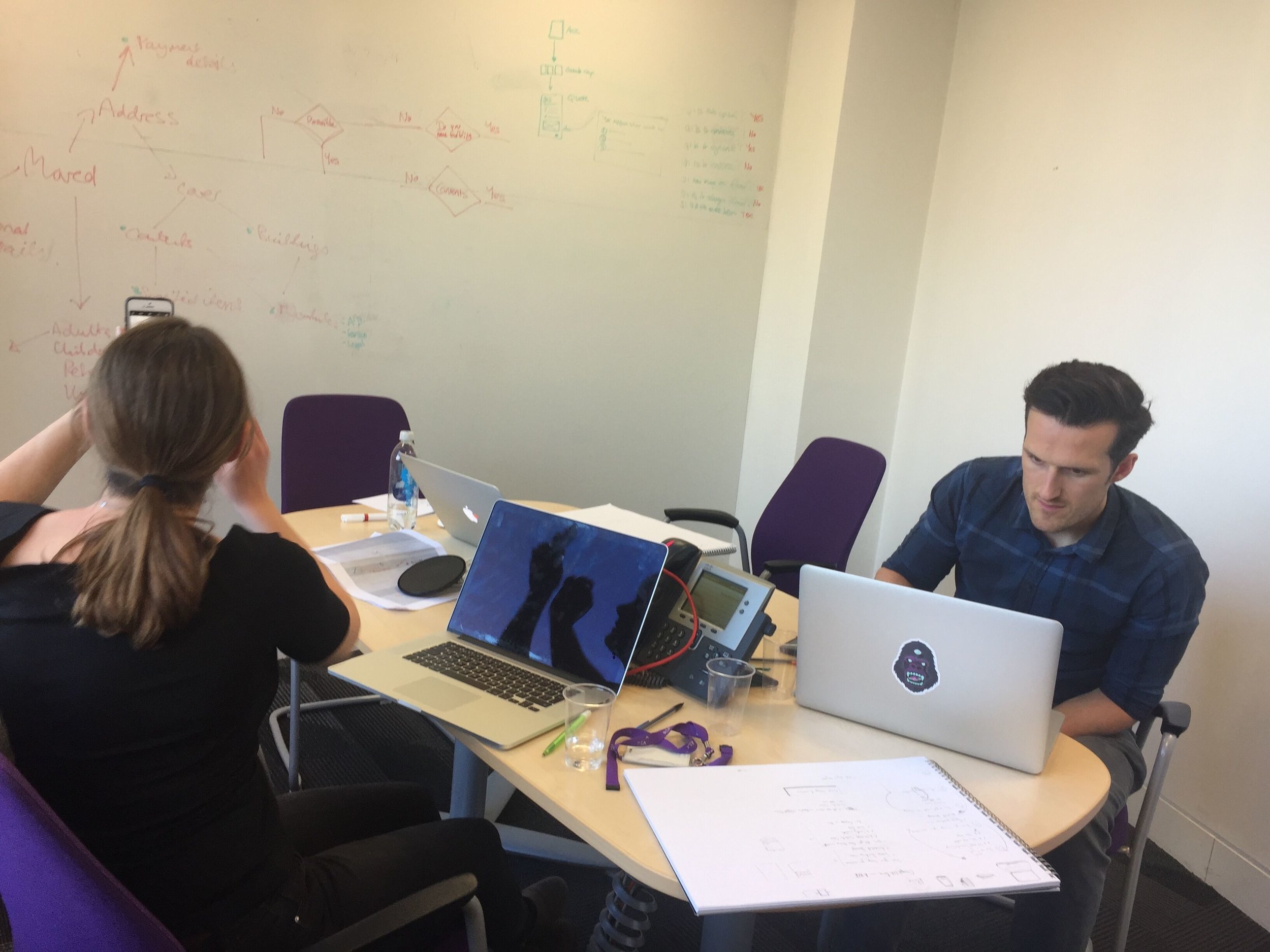
The team was made up of myself in the UX design and research role, a lead content designer and a lead designer.
Discovery
We began discovery by trying to understand the problem space of MTAs. This started with the call centre and speaking to key customer adviser leads about their experience. Our questions and areas of focus included:
How many MTAs can you do?
How often do customers need to complete them?
How complicated are they?
We also needed to understand and build on previous ‘self service’ work completed by other members of the Digital team. Projects had been run to help customers carry out tasks more effectively in their account area. As this was often the starting point for online MTA journeys, there were a few key learnings, despite being built on older platforms and for specific brands. By aiming for a ‘Blueprint’ (now an early understanding of a wider ‘Design system’) we could create a brand agnostic experience that could be used by all the brands RSA underwrites.
Mapping the process
As we got information back from the call centre, we tried to understand how varied the experience was across the 40ish MTAs that customers could do against a live policy. We then affinity mapped the MTAs to understand:
Where do different groups vary?
Where are they the same?
What key principals apply to all?
This lead us to try and establish how we could test and validate these assumptions so far.
Approach:
We ran the project as 8 ‘time boxes’ (3 day mini sprints) from sketching, prototyping to testing & iterating. Constrained heavily by time and other important projects, the ‘time boxing’ allowed important focus to take place on the MTA designs. Where possible, this needed to include validating legal requirements (compliance teams), infrastructure requirements (architecture teams) and approach (contact centre teams).
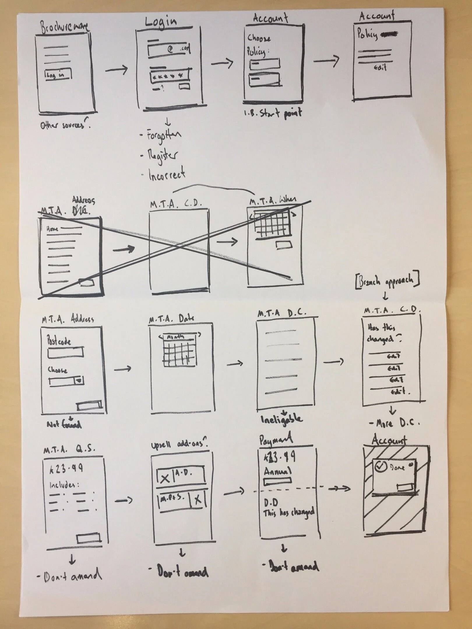
Information Architecture and Interaction Design
As with many well designed digital experiences, the key component what understanding the content, which meant which questions we needed to ask customers, which decisions they needed to make and what we needed to play back to them.
Working as a team we used our knowledge of quote and buy journeys to determine the order of the questions, how they were grouped together and how the customer would input their answer most effectively.
Early research and iterations
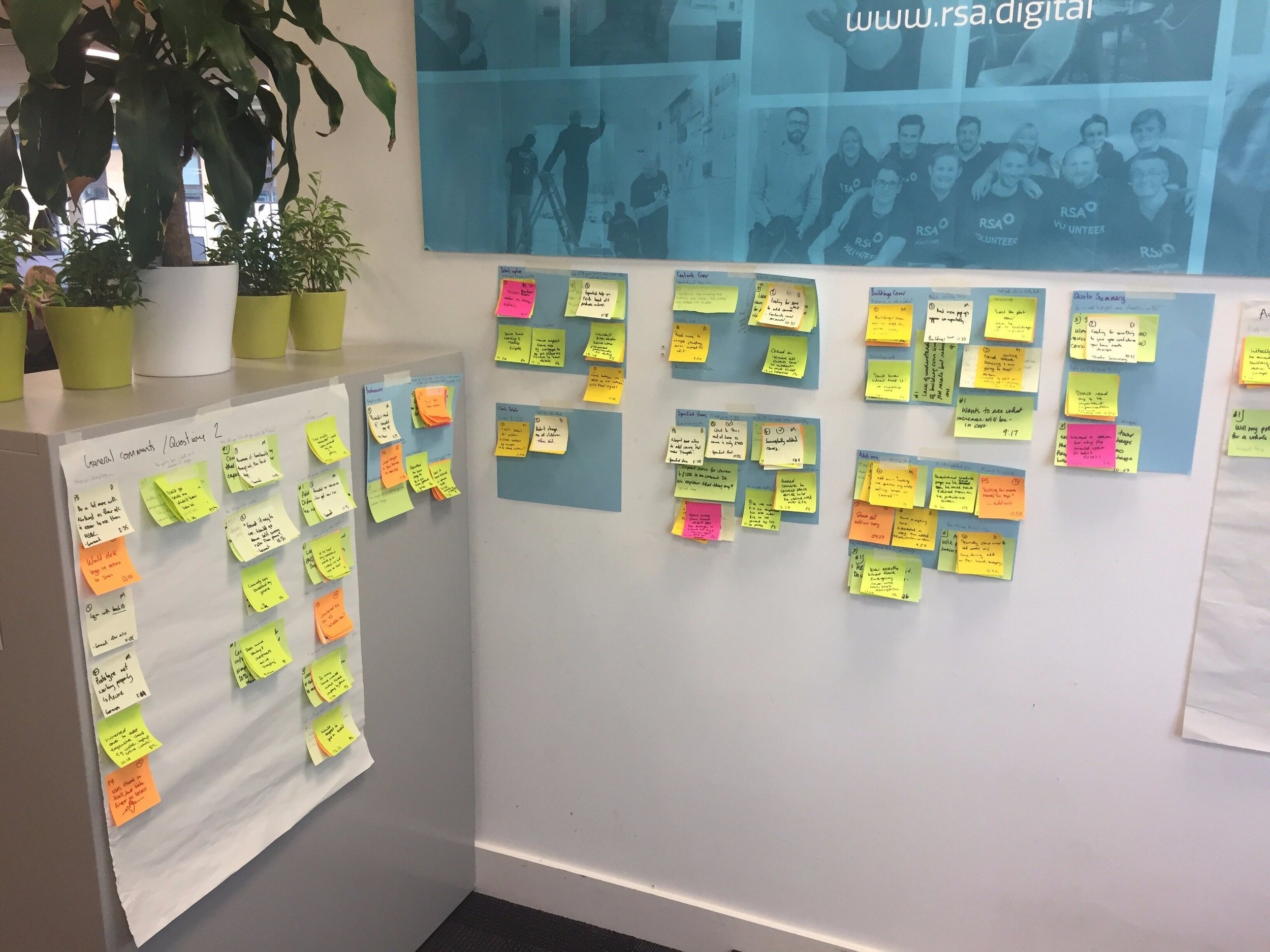
We began user testing our prototypes through guerrilla testing on internal staff at RSA. We tried to find people with no advanced knowledge of home insurance whilst acknowledging they would always know more than the average customer. This really helped up discover some key usability issues and meant we could continue to iterate.
A key area people kept struggling with was understanding what items they had already told us about and trying to add new ones into the correct areas. Despite our best challenges, the product is still structured by a pricing model that isn’t always obvious to customers, meaning they have to potentially think quite hard about where to add their jewellery, watches, bikes, electronics and other valuable items they take out of the house.
More formal research
After about 21 rounds of testing and iterations, I organised a lab in London so we could try the prototype on users recruited to match our customers as closely as possible. Aware that I had also been involved in the design of the prototype, I made sure there was also an independent moderator there to run some of the sessions, and give impartial views on how people were getting on.
The lab session lead to a few more iterations around confirmation and payment but showed that many of the issues we’d identified in guerrilla testing had mostly been ironed out.
Despite the project being partly driven by client need, the wider business timings meant that development work wouldn’t start for nearly a year so we worked with front-end developers to build out the prototype in a higher fidelity along side a supporting presentation.
Learnings & key principals discovered:
1. One MTA often leads to other interactions. They seem to be interconnected.
2. Break interactions down as small as possible - ‘One thing per page’.
3. Playback what you’ve just changed - after confirmation, in the account area.
4. Load details capture with existing customer data so you can pre-populate.
5. Explain how and why prices have changed (previous payment vs new one).
6. Ask the date first to prevent wasted journey (constraint of back-end).
7. Keep ‘change address’ option at the top level - not everyone is aware you can do it.
8. Check for related changes before completion (the quote summary is modular by design).
9. Accept the limitations of digital over a call centre (bereavements etc).
Project Learnings
The ‘time boxing’ approach helped enable the team to work together but meant the project didn’t always have the best momentum.
Not having a client deadline meant other parts of the business were less willing to input to the project promptly which lead to some delays.
Summarising the project as a HTML & CSS prototype with a supporting presentation helped preserve knowledge and should be implemented as a minimum for other projects.


